# Core UI
Building a UI template from Figma in Flutter is quite labor-intensive, from typography, font styles, colors, to the widgets used in the application. Typically, in personal projects, we tend to reuse interface templates we've created before to save time on app development, for example, web and app applications with nearly identical interfaces. Separating reusable interface code into a different part of the application is a clean coding method and also applies knowledge of object-oriented programming. Additionally, it can be transformed into multiple themes within your app.
## **Overview of Building a Core UI for an Application**
Take a look at thewebsite . It is built with Flutter, and I will walk you through how I structured a separate UI for my web application.
Core UI for an Application
As shown in the image, I placed all UI components inside the **packages** directory outside the `lib` folder and named it `web_ui_core`. You can also see several other core UI packages around it, which I plan to reuse in future projects.
You might be wondering how I synchronize these packages across different projects. The answer is: I use **Git** to manage them. I will explain this in more detail in the article about packages.
{% content-ref url="../architecture-code/package" %}
[package](https://wong-coupon.gitbook.io/flutter/architecture-code/package)
{% endcontent-ref %}
The image above shows how I implemented a UI package for this website. The same approach applies to the UI of my mobile applications.
I divide it into five main parts:
**`assets` folder** – This contains colors, SVG icons, and UI-related images. Any images unrelated to the UI are stored elsewhere. I use the [`flutter_gen_runner`](https://pub.dev/packages/flutter_gen_runner) package to automatically generate asset paths in the `gen` folder, making them easily accessible and reducing errors. I will explain this in more detail later.
**`artist` folder** – This includes colors, SVG transformations, gradient effects, shadows, and styles for widgets. I have written a short article about switching between dark and light themes.
{% content-ref url="dark-mode" %}
[dark-mode](https://wong-coupon.gitbook.io/flutter/ui/dark-mode)
{% endcontent-ref %}
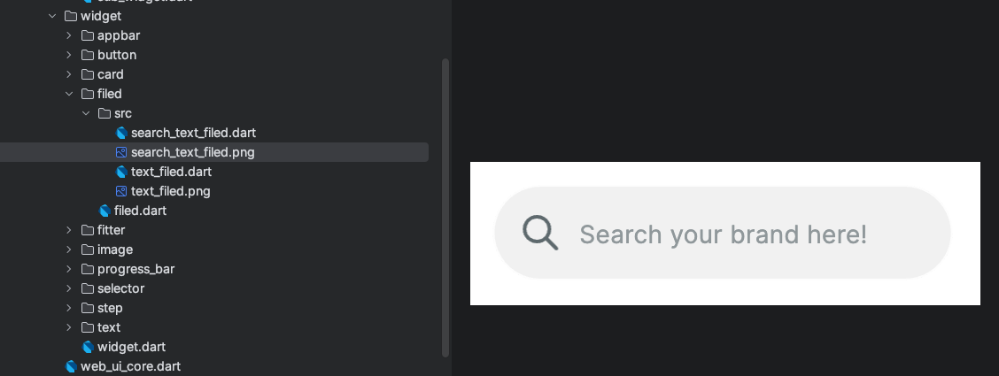
**`widget` folder** – This contains reusable widgets.
widget folder
Here’s an example of a **search input field (`search_text_field`)** that I created. I also take screenshots of widgets for future reference, making it easier for colleagues to find and reuse components instead of rewriting them.
**`sub_widget` folder** – This holds secondary UI components such as **dialogs** and **bottom sheets**. Common dialogs include **confirmation dialogs, notification dialogs, and date-time pickers**.
## **How to Set Up a Core UI Package**
From the structure outlined above, you may notice that there are quite a few directories. To manage this efficiently, I use **Mason**. If you're unfamiliar with Mason, check out my article here:
{% content-ref url="../easy-code/mason" %}
[mason](https://wong-coupon.gitbook.io/flutter/easy-code/mason)
{% endcontent-ref %}
You can also refer to my code template and create your own, as this article does not cover some core libraries. Here is my template: [`dr_ui_core`](https://brickhub.dev/bricks/dr_ui_core).
Now, I will guide you through how I set up my personal core UI package.
### **Step 1: Set Up the Package**
The first step is to create a package that will contain the UI components you plan to add. Name it `..._ui_core` so that you can easily distinguish UI core packages from other core packages. Check out my article on how I organize my packages.
{% content-ref url="../architecture-code/package" %}
[package](https://wong-coupon.gitbook.io/flutter/architecture-code/package)
{% endcontent-ref %}
Create a `packages` folder outside the `lib` directory and then run the following command:
```sh
cd pathTo/packages
flutter create --template=package web_ui_core
```
### **Step 2: Add Essential Libraries**
Next, add some libraries to improve code clarity and maintainability by running:
```sh
cd pathTo/web_ui_core
flutter pub add lint
flutter pub add test
flutter pub add mockito
```
I recommend using the [`lint`](https://pub.dev/packages/lint) package, which helps enforce clean code practices following [**Effective Dart**](https://dart.dev/effective-dart). I will cover this in more detail in my article *LINK*.
{% content-ref url="../clean-code/clean-code" %}
[clean-code](https://wong-coupon.gitbook.io/flutter/clean-code/clean-code)
{% endcontent-ref %}
### **Step 3: Replace `analysis_options.yaml`**
Replace the contents of `analysis_options.yaml` in your package with:
```yaml
yamlCopyEditinclude: ../../analysis_options.yaml
```
This ensures that the package follows the same `analysis_options.yaml` as the entire project. I will share the `analysis_options.yaml` file I used in the project that powers this website.
```yaml
# This file configures the analyzer to use the lint rule set from `package:lint`
include: package:lint/strict.yaml # For production apps
# include: package:lint/casual.yaml # For code samples, hackathons and other non-production code
# include: package:lint/package.yaml # Use this for packages with public API
# You might want to exclude auto-generated files from dart analysis
analyzer:
errors:
invalid_annotation_target: ignore
plugins:
- custom_lint
exclude:
- packages/mason_core/**
- '**.freezed.dart'
- '**.g.dart'
# You can customize the lint rules set to your own liking. A list of all rules
# can be found at https://dart-lang.github.io/linter/lints/options/options.html
linter:
rules:
- unawaited_futures
rules:
# Util classes are awesome!
# avoid_classes_with_only_static_members: false
# Make constructors the first thing in every class
# sort_constructors_first: true
# Choose wisely, but you don't have to
prefer_double_quotes: true
prefer_single_quotes: true
avoid_dynamic_calls: true
lines_longer_than_80_chars: true
avoid_classes_with_only_static_members: true
use_named_constants: true
```
### **Step 4: Generate the Prebuilt Code with Mason**
I will use **Mason** to generate the code template I introduced at the beginning of this article.
```bash
cd pathTo/mason
mason make dr_ui_core -o pathTo/lib
```
Then, copy the folders inside `out_site_lib` into the `lib` folder of the package.
### **Step 5: Set Up `flutter_gen_runner`**
[`flutter_gen_runner`](https://pub.dev/packages/flutter_gen_runner) simplifies asset management and reduces errors. Run the following command:
```sh
fluttergen -c pubspec.yaml
```
This library makes working with assets much easier and helps minimize mistakes. Check out my article on **coding faster** for more details.
{% content-ref url="../easy-code/tip-code-faster" %}
[tip-code-faster](https://wong-coupon.gitbook.io/flutter/easy-code/tip-code-faster)
{% endcontent-ref %}
I have already preconfigured all the necessary settings for `flutter_gen_runner` in the template.
### **Step 6: Add the Package to Your Project**
In the project's `pubspec.yaml` file, add:
```yaml
dependencies:
web_ui_core:
path: packages/web_ui_core
```
#### **Final Notes**
After setting everything up, you may notice that a **`ui_core` package** is missing. This is a core package, but it won't cause issues if you remove it and create your own version.
I will cover the missing components in a later section. Since the `ui_core` library requires an in-depth explanation, I will introduce it in an upcoming article.
## **Explanation of Basic UI Setup**
### **Light & Dark Mode**
I have written a dedicated article on this topic, which you can find here:
{% content-ref url="dark-mode" %}
[dark-mode](https://wong-coupon.gitbook.io/flutter/ui/dark-mode)
{% endcontent-ref %}
```dart
extension WebColorContext on BuildContext {
Color get white => isDarkMode ? WebColor.blackForDark : WebColor.white;
}
```
**Details on the `isDarkMode` variable:**
```dart
extension MyThemeModeContext on BuildContext {
bool get isDarkMode => switch (myThemeMode) {
ThemeMode.system => MediaQuery.of(this).platformBrightness == Brightness.dark,
ThemeMode.light => false,
ThemeMode.dark => true,
};
}
```
**Usage:**
```dart
context.white
```
### **Font Scaling**
One common issue we face is that font sizes need to adjust based on screen size. For example, the font size on mobile and web differs. You can see this effect directly on this website—font sizes dynamically change depending on whether the screen is large or small.
Here’s how I handle it:
```dart
extension WebTextStyle on BuildContext{
/*static const _neoTextStyle = TextStyle(
fontFamily: WebFontFamily.nanumSquareNeo,
fontFamilyFallback: [
WebFontFamily.pretendard,
],
package: 'dsg_ui_core', // Thêm thư viện front chữ từ package: https://api.flutter.dev/flutter/painting/TextStyle-class.html#:~:text=To%20use%20a%20font%20family%20defined%20in%20a%20package%2C%20the%20package%20argument%20must%20be%20provided.%20For%20instance%2C%20suppose%20the%20font%20declaration%20above%20is%20in%20the%20pubspec.yaml%20of%20a%20package%20named%20my_package%20which%20the%20app%20depends%20on.%20Then%20creating%20the%20TextStyle%20is%20done%20as%20follows%3A
height: 1.5,
leadingDistribution: TextLeadingDistribution.even,
color: WebColor.blackText555164,
); */
static final _webTextStyle = GoogleFonts.inter().copyWith(
fontWeight: FontWeight.w600,
height: 1.5,
leadingDistribution: TextLeadingDistribution.even,
// color: WebColor.neutral80,
);
/// Edit ratio of fontSize for responsive screen
double get webRatio {
final width = MediaQuery.of(this).size.width;
final ratio = width / 1440;
// final textScaleFactor = ratio < 1 ? ratio < 0.8 ? 0.8 : ratio : 1;
// if (width > 600) {
// return 1.5*textScaleFactor;
// } else if (width > 400) {
// return 1.2*textScaleFactor;
// } else {
// return 1.0*textScaleFactor;
// }
return ratio < 1 ? ratio < 0.75 ? 0.75 : ratio : 1;
}
/// Heading
TextStyle get h46B =>
_webTextStyle.copyWith(
fontSize: 46 * webRatio,
fontWeight: FontWeight.w700,
color: neutral80,
);
}
```
In the code above, you can see that I calculate the **horizontal scaling ratio** (`webRatio`) by dividing the current screen width by the width designed in **Figma**. However, I keep this ratio within the range of **0.75 to 1** to ensure that the text does not become too small when the screen size is reduced.
Additionally, I use **GoogleFonts** for easy font management. You can add your own custom fonts by referring to my comments in the code.
**Usage Example:**
```dart
Text("Hello", style: context.h46B)
```
You can fully customize the text style to match your **design system**. Here’s an example of customizing the color:
```dart
Text("Hello", style: context.b10B.copyWith(
color: context.neutral00,
))
```
### **Custom Widgets**
Using **screen scaling ratios** and **Figma-based dimensions** is common when designing **custom widgets**.\
Here’s an example of how I combine **colors, text styles, and scaling ratios** into a custom widget:
```dart
class WebCardBloc extends StatelessWidget {
const WebCardBloc({super.key, required this.title});
final String title;
@override
Widget build(BuildContext context) {
final ratio = context.webRatio;
return Container(
decoration: BoxDecoration(
color: context.blueSea,
borderRadius: BorderRadius.circular(28*ratio),
),
padding: EdgeInsets.symmetric(vertical: 5*ratio, horizontal: 10*ratio),
child: Text(title, style: context.b10B.copyWith(
color: context.neutral00,
),),);
}
}
```
#### **Using the Widget in the UI**
```dart
const WebCardBloc(
title: "Available on Google",
),
```
For more details, check out my article on **responsive screen design** at here.
{% content-ref url="responsive" %}
[responsive](https://wong-coupon.gitbook.io/flutter/ui/responsive)
{% endcontent-ref %}
## Icon
One of the indispensable parts of a UI kit is the icons. I love using SVGs because of their light weight and simplicity. If an icon is complex, I tend to prefer using PNGs over SVGs.
I use [flutter\_gen\_runner](https://pub.dev/packages/flutter_gen_runner) to simplify the process of creating these icons. First, I save them in the assets folder, then configure them in the package's pubspec.yaml file as follows:
```yaml
# Install: dart pub global activate flutter_gen 5.6.0 (Windows)
# Add C:\Users\SHD\AppData\Local\Pub\Cache\bin to the PATH in the environment variables
# Run: fluttergen -c pubspec.yaml
flutter_gen:
assets:
enabled: true
outputs:
class_name: DsgAssets
package_parameter_enabled: true
fonts:
enabled: true
outputs:
class_name: DsgFontFamily
package_parameter_enabled: true
colors:
enabled: true
outputs:
class_name: DsgColor
package_parameter_enabled: true
inputs:
- assets/colors/color.xml
output: lib/gen/src/ # Optional (default: lib/gen/)
line_length: 80 # Optional (default: 80)
integrations:
flutter_svg: true
flare_flutter: true
rive: true
lottie: true
flutter:
assets:
- assets/icons/bold/
- assets/icons/light/
- assets/icons/logo/
```
Then run this command to generate the icon paths in the gen folder:
```bash
fluttergen -c pubspec.yaml
```
You can find more detailed setup instructions on the library's website:
This way, using icons becomes much easier while ensuring the accuracy of the icon paths.
```dart
Widget build(BuildContext context) {
return Image.asset('assets/images/profile.jpeg');
}
```
Change to:
```dart
Widget build(BuildContext context) {
return DsgAssets.images.profile.image();
}
```
This is how I implement a **UI package**, keeping it separate from the `lib` directory for easier maintenance, scalability, and cleaner code organization.
To learn more about how I **synchronize packages across projects** without manually copying files, check out my article on **package management** at here.
{% content-ref url="../architecture-code/package" %}
[package](https://wong-coupon.gitbook.io/flutter/architecture-code/package)
{% endcontent-ref %}
[Buy Me a Coffee](https://buymeacoffee.com/ducmng12g) | [Support Me on Ko-fi](https://ko-fi.com/I2I81AEJG8)
.png?alt=media)
.png?alt=media)